Saturday, 13 November 2010

Evaluation

The brief of my project was to create a product or service that would improve the sustainability of a company. I initially chose Oxfam as my company but there were communication problems that leaded to one needing to chose another company to work for. I chose BANES after thinking about the possibilities of what I could create with all the companies. I knew i wanted to create an advertisement and the food recycling bins that were being released in October was the perfect opportunity to base my advertisement on.

I began my process by researching other food companies such as 'Love food hate waste" to look at their current advertisements. I also looked at the ways other companies advertise, mostly government run companies and charities such as Sustrans. I noticed a pattern of positive messages portrayed in pictures and colourful writing and found a niche: Scare tactics.

Overall I feel my poster was success full. It followed my personal brief of using scare tactics to portray a different side of recycling. My final outcome has a similarity to my drafts which shows I followed them well but also allowed room for improvement. The fact that my images were hand drawn allowed me to create the poster exactly how I wanted it.

Judging by the feedback that was left by our partner, I did very well at communication with my partner in BANES. The problems faced with Oxfam showed me the importance of strong communication which helped me with my relationship with BANES.

"I thought you conducted yourself very well at the meetings. You were prompt, welcomed me and explained what was needed from me. You had clear ideas about what they wanted to do/achieve and all ideas were relative and played to your individual strengths"

However, the feedback given from Tim and his boss from BANES was not positive. They felt that my idea would not be well received by the public as the message wasn't clear enough that pests out be prevented by using the food bins. In a professional situation the company creating the product would have had a more detailed brief and many meetings to discuss the progress.

If I could do the project again, there are a few things I would do differently:

  • A strong communication between partners is very important, If I had the chance to work with Oxfam again i would ensure that my partner would be up to date with my progress and both sides knew about meetings and deadlines to ensure a strong partnership throughout.
  • I would have a variation of ideas to show my partner. Tim was not keen on my idea when i first showed it to him but unfortunately joining the group late resulted in no time to change the idea.
  • I would have spent more time on research into other food posters to use as insperation as I struggled to think of a strong idea at the begining.
Overall I think my project went well during the process. Having problems with the first partner helped me understand the importance of having regular contact with the partner your working with. My poster turned out well, although the concept was lost in the process, if i had more time i would make the message clearer for what i needed to portray. I am pleased I did this project as it has allowed me to cover all the areas I am interested in, such as fashion, advertising, drawing and photo editing.
Click to view larger


Final meeting 3/11/2010

Timothy rawlings from BANES sat down with the group to look at our final peices, and then took them with him to show his boss to get overall feedback on our outcomes and the processes to get there.

From: Timothy Rawlings
To: Charlie Williams

Charlie joined the working group late and as a consequence had less time to get an idea on the table to discuss with me. Her idea was relevant to the Council's current Food Waste recycling campaign and she presented two posters of the same concept, one with maggots and one with rats.

Her idea was to highlight a common problem associated with Food Waste, that being human food waste ending up as food for rodents and pests. While the idea is relevant, I was not sure if the messgae was clear. Given that we need to promote a recycling collection, highlighting a negative aspect may not be the best way to pursuade people. The message hinted that "if you use the collections you are not feeding the rodents" which is more positive (the trouble is the Council is not keen to point out that there would be any pests or maggots in our neighbourhood!). With more time and guidance from the client Charlie could have made the message clearer.

The design of the poster was good and the use of the cooperate style was spot on. The Colours of the poster tied into the current promotional material being issued and the pictures were interesting. Charlie took suggestions about the cooperate style and applied them well into her final design. she was also good at communicating her ideas initially and catching up with the progress of the other two in our working group.

Thursday, 4 November 2010

Keynotes

We created a keynote presentation in lesson that had to include some information on each company, and also 5 other creative workers within the community.

Wednesday, 20 October 2010

Draft Analysis

I analyzed my draft poster, asking other peoples opinions on what I needed to change. It is important to get other peoples opinions on a piece of work as it gives a wider veiwpoint, and they are more likely to see what the audience will see.
As both of my potential posters are very similar, they had many of the same problems i needed to change. One of which was the taglines 'one mans trash...' was hard to read. It took a lot of experimenting using illistrator to try and find a font colour which would stand out over the picture.


Another problem with both posters was the top section, It was pointed out that there was too much information. After moving around the different sections of font I decided to delete the 'your new food recycling service', as this has already been featured on one of their current posters.

Thursday, 14 October 2010

Maggot Drawing

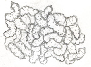
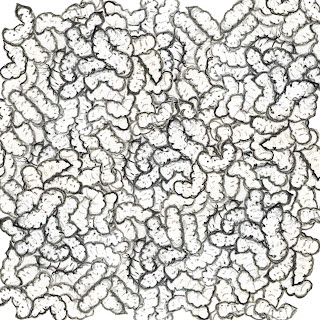
I needed to draw a large amount of maggots for my piece. I decided to fill a 5cm X 5cm area with maggots to provide some variety to my image. I then scanned the image into Photoshop and used the copy, paste and free transform tools to tile my maggots without creating a visible pattern.


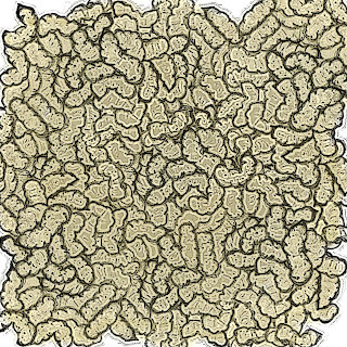
I then used various filters to define my image to avoid it looking too much like a drawing. I used the contrast tool to darken the lines of my image to remove any pencil marks. I used the plastic wrap filter to try and provide some 3D texture to my Maggots to make them look more realistic whilst still in keeping with the illustrated theme.


I used a paintbrush set to a high opacity to colour my maggots. I had to research images of maggots on the internet to try and find the common colour. I then used the colour sampler tool to extract a colour to use. I washed the colour over a separate layer and placed it behind the maggot image as to not lose the dark lines of the image, which i would have done if i had placed the colour on top of the same image.

Rat drawing

Before i began to draw my image, i looked at actual photos of rats as i needed my image to look as realistic as possible, so it would still have a strong message but would not affect the audience.


I then scanned the image onto Photoshop and used different filters and techniques to try and make the rat look defined and detailed. I used a paintbrush with a high opacity setting to achieve the colouring.


I then wanted a kitchen background. I found an image on the internet of the style kitchen i wanted to use. I used the tracing paper tool in painter to create an outline of my kitchen using the image off the internet, and then added to it myself to create my background.

14/10/2010

Today I had a meeting with my teacher about my progress so far. I showed Jo my blog and then my poster. We discussed the Practical, Financial and Legal obstructions of the poster and how to go around them. We also spoke about the layout and content of my poster, including the font and colour choice and the overall presentation. It is important that i make it clear that the maggots poster must be clear that the food bins are an aim to avoid the maggots. This must be made more obvious by using slogans.
There is also a problem with the colour of my writing, as it is not readable.

Me and a member of my group debated about the information given to us about what fonts to use. I thought that we had to use Ariel as the set font, as used in all other BANES posters, however she thought it wast compulsory. We emailed Tim from BANES to sort out our query.
This is a list of all the things i need to do to compete the project

Experiment with the poster layout using Photoshop
-moving around fonts
-changing the shape of the picture

Make the writing clearer
-Experiment with different fonts
-Experiment with different colours
-Move around the fonts
-Change the size of the fonts

Wednesday, 13 October 2010

Interactive practitioners

Sustrans

Sustrans are a charity that aim to provide alternative ways to travel other than a car. They work with many other companies, local authorities and the community to try and improve the health of people and the environment.
This particular poster displays the fact that leaves on the line would affect people who ride on trains but not people who cycle. The photograph uses the perspective of someone looking down onto a cycle track. The white diagonal line that cuts the image across one corner links with the phrase 'leaves on the line?' that works well. There is a limited palette of colour on the image, as the pavement and paint is monochrome and the only colour is the leaves. This works well as the leaves are the main subject of the poster so they stand out. Like my rat idea, the image is set at a perspective of someone on the pavement, but all the text added digitally is at a straight on perspective. I think that this allows the reader to decipher between the image and the information, which could be difficult when using an image with text. This is similar to my work as it uses a simple image and a tag line which leaves a powerful image in the viewers head. This theme is carried out in many of their other posters, such as an image of a bike seat with 'a guaranteed seat every day' printed above it. Although the font is small it carries a strong message about what the charity are trying to provide. The use of short, snappy and well known tag lines is what i am aiming to achieve in my work.

Source: http://www.sustrans.org.uk/

Interactive practitioners

Claes Odenburg

Claes Odenburg is a Swedish American sculptor born in Sweden 1929. He began using soft materials to create large scale sculptures of objects, which were sometimes interactive. He describes his work as the ‘celebration of the everyday’ and creates it to defy our perceptions of the every day life. He works alongside the Dutch-American pop artist, Coosji Van Bruggen to create his large scale sculptures. They began collaborating in 1976 and got married 1977. In the early 1970s and again in the 1990s the pair also collaborated with Frank o'Gehry. They were said to have broken the boundaries between architecture and sculpture. Initially his work received lots of criticism as people did not understand what he was trying to produce, however his quirky inanimate object sculptures won the hearts of the community as it looks at inanimate objects in a completely different light. Odenburg begins the process by creating many small sketches, that would include the background to show the scale in which he wanted to create the model. He then creates some small scale models using cheap materials such as cardboard and wire. He uses many different materials when creating his large scale models, such as his 'apple core' piece, situated in Jerusalem, that contains steel, foam, resin and enamel and stands at 7ft tall. He uses soft materials to create objects that should be hard, and large objects when they should be small, forcing the viewer to reassess their perception of the objects.

Sources:
http://en.wikipedia.org/wiki/Claes_Oldenburg
http://www.guggenheimcollection.org/site/artist_bio_121.html
'Claus Odenburg : An Anthology' - Hayward Gallery

Interactive practitioners

JR

JR is a photographer who displays portraits of people in controversial and public places.
He began as a graffiti artist as a teenager but was introduced to photography soon after; He now calls himself a “photgraffeur”
Unlike many interactive practitioners, JR has never had to ask for planning permission, as he stays anonymous. This allows him to exhibit his work wherever he wants. JR is respectful with his work. His images on the rooftops in Kibra were made of vinyl, which made the residents houses waterproof. The corrugated metal used to display his work in other areas is distributed between all those who had taken part. All the money JR makes from auctioning his work is put back into the project to insure his work is sustainable. There is an interestnc perspective of his work, as it is all on the rooftops, which means there would be no way to see it unless you were up in the air. JR only uses black and white photography on all his projects, Which works well in this paticular project as it contrasts with the orange buildings.
The Parisian riots in 2004 allowed JR to produce a new exhibit, pasting up photographs on the walls on Marias. His work was praised for its unique photographs, as they contained residents of the location pulling funny faces through a fish eye lens. This was different to all other images of the rioters that were taken with a long lens which displayed the destruction. JR’s unique take to the event confronted passers by with a more human image.
The idea of putting a new perspective is similar to my work, as I am looking at the positive aspects of recycling bins from a negative point of view.

Sources:
http://www.guardian.co.uk/artanddesign/2010/mar/07/street-art-jr-photography

Interactive practitioners

Tim Noble and Sue Webster

Tim Noble and Sue Webster are artists based in London, where they work and live together. Their work is created by meticulously placing pieces of rubbish that has been picked up around London, so as when a light is projected at the sculpture an image is projected on the wall. Looking at the piles of rubbish there does not appear to resemble anything; however the shadows it creates are detailed and recognised images in silhouettes. Usually as a sculpture there is unlimited perspective in which this can be shown, however, the actual art is what is projected on the wall which makes the image a flat straight on veiw.. The rubbish that is used contains a lot of texture which makes the shadow more realistic and the colour contained within all the rubbish does not effect the overall shadow.
They also work with lights to create images that reference pop art. These light sculptures resemble carnival rides and often have flashing lights and words expressing love or hate.
Scrap metal, food packaging and the remains or dead creatures such as rats, are collected by Noble and Webster in their every day life. They pick up dead rats off the floor and put them in their freezer as they feel it would come in useful in one of their later sculpture. Once they have found a use for all of the rubbish, they begin creating the precise sculptures, making sure everything is in just the right place to create the silhouette.
This is a strong way of making use out of every day rubbish and turning it into something amazing. This work could be used in inspire the groups working with the scrap store. Sculptures could be made out of all the artistic materials donated by the companies, which could advertise the good use that can be made out of the scrap donated.

Source: http://www.youtube.com.com/watch?v=a-Ki-abe1RM
http://en.wikipedia.org/wiki/Tim_Noble_and_Sue_Webster

Interactive practitioners

Lady Gaga


Lady Gaga’s meat dress has been the topic of many debates since she wore it at the VMA awards. Created by Franc Fernandez, the meat dress has many interpretations. Gagas interpretation is that the dress stands for “if you don’t stand up for what you believe in, soon you will only be worth the meat on your bones”.

They way that the dress has been displayed disgusts most of the viewers, however I feel that it makes a statement of the worlds view on food. The majority of Europe and America eat meat every day, however when displayed in its natural state they cannot handle it.

It is said that lady gaga wore this outragous outfit to symbolise war, claiming that it represents the waste of life.

Friday, 1 October 2010

obstructing factors

Although i want to apply scare tactics to my poster by using graphic images of maggots and rats, there is a possibility that people will be too affected by the images to read what the poster is about. This affects my process as it makes me have to change my idea. Ive decided that the images are going to be drawn which would decrease the amount of people that are unable to look at it due to fear. I will be finding pictures of my subjects (rats and maggots) by taking photos of maggots in a fishing shop and using the image to draw them. I will take a picture of someones pet rats for inspiration for my own drawing. This is a strong idea as the final result can look exactly as i want it to.

Wednesday, 29 September 2010

Second meeting with Banes 29/9/10

We met a representative from BANES for an update on our ideas.


The first design

I presented my idea to Tim, explaining my idea of scare tactics to make people want to use the food bins. He liked the idea but explained that people may find this inappropriate and will not reads the rest of the poster if they are too affected by the image. he did advise that i add a second tag line that links to the 'One mans trash' that would balance out its negativity. He also explained the colours and the fonts we should use. BANES advertising always use Ariel font as it is easy to read. They do not have a set colour scheme but they do use a boarder on all of their posters that i will include. He also explained that they always include the phrase "making bath and north east somerset an even better place to live" using the same type font and making the 'even' bold.

Example of a BANES leaflet.

Friday, 17 September 2010

Emails

This shows the conversations between my group and our partner. This shows the communication with our partner before and during my inclusion in the group. I think it shows that we have strong communication skills and that we kept in contact with our client throughout.


E-Mails Between My Group and Partner

To whom it may concern,

I am writing to you to arrange a date to meet our group to discuss ideas. We would like to request a time somewhere on Wednesday (the 23rd of June) afternoon. Could you please reply to this eMail to confirm that you are available on this day, and to finalise a time and place.

Yours Sincerely,

Harriet and Oliver

19/06/10

Hi Harriet and Oliver,

Thanks for getting in touch, I am free on Wednesday afternoon so I can come to the College to meet you, is 2 o'clock ok? Please let me know if this is ok and where it is we should meet.

Thanks and regards

Tim

21/06/10

Hi Tim, that's fine. We will meet you at the reception of college at 2pm.
Thanks, yours sincerely,
Oliver and Harriet

21/06/10

That’s great, please let me know if you need me to bring anything.

Tim

21/06/10

Hi Ollie and Harriet,

Hows it all going? I have not heard back yet about any feedback forms that I need to complete. Hows is the progress going on the projects? Please let me know if there is anything I need to be doing or anything you need.

Thanks and regards

Tim.

01/08/10

Tim,

Our projects are all going fine, we're working at different levels and if we need anything we'll let you know.

We should probably schedule another meeting soon, so you can have some form of input.

Just so you know, another class member will be joining the BANES group if that's alright with you. She will do the work she needs to to catch up, and she already knows the brief. Her name is Charlotte and I have given her your e-mail address so she can catch up.

Regards,

Harriet, Ollie and Charlotte.

08/08/10

Hi Tim,

We are going back to college on September 9th and have been working on our projects over the summer.

Would you please meet with us to discuss our next few steps, and to see how we could improve our work.

Yours sincerely,

Ollie, Charlotte and Harriet.

02/09/10

Hi Harriet.

Sorry I have been away for the last few weeks, I will happily meet with you, please let me know when is best for you.

Thanks

Tim

20/09/10

Hi, could you do Wednesday 29th please?

Thanks,

Harriet, Ollie and Charlie

20/09/10

Hi Harri,

Yep the 29th should be fine, what time is best for you? I'm over at Bath Spa Uni all day so I can come at any time. Did Charlie Williams join your group?

Thanks

20/09/10

Tim,

We're at college 9am till 3.30pm so whenever really.

Yes she did, and she said please can you bring the food waste bins that you brought to our induction at the college?

Thanks,

Harriet, Oliver and Charlotte

20/09/10

Harriet,

Could we say 11:30? Gives me time to get on with a few things first thing.

Tim

20/09/10

Tim,

Yeah that’s fine. I will let you know where we are meeting as soon as I have sorted out a room.

See you then,

Harriet, Ollie, Charlie

21/09/10


Thursday, 16 September 2010

Planning

This is a brief plan of all the things i have to do to complete this project

Creating a table displaying what i have to do allows me to keep track of everything i have done.

Wednesday, 15 September 2010

Initial ideas

After looking at previous BANES and food recycling posters, i sketched a few initial ideas. This idea is similar to the love food hate waste posters, as it contains one simple statement. also the angles of the images are the same. The text 'Food can be recycled too' is strong as there is alliteration of the 'oo' in food and too. it is also very basic and straight to the point. The idea of the bin on the right of the image allows me to describe the sorts of foods that can be recycled, as these are written on the side of the bin. This means the image is not full of text.
This second idea is more complicated and contains a lot more information. However i like the playfulness of it. The idea of making the process look like a maths sum is ironic against the text 'its not rocket science'. from far away this poster would look really complicated but i feel if i develop it more, it would be easy to read.
After having a meeting with my teacher I decided to change the outcome of my poster. I wanted to create something different to the usual posters created by BANES. Looking at other of their poster designs I have noticed they have a small amount of characters that look continuously happy whilst recycling. They also use the same illustrations in their posters and leaflets instead of using photographs. I had the idea of using scare tactics to put a new spin on their regular poster. Using photographs to display the truth about what will happen if their food is not recycled. I came up with 2 ideas that continued the same idea but with different situations.
Using images of rats and maggots puts recycling food into a new perspective will hopefully draw in the audiences attention as it isn't similar to what they have seen before. Scare tactics have been used in the past on other posters and adverts such as Think! who showed a controversial advert on TV to scare the viewer into wearing a seat belt. This personally sticks in my head and ensures I follow its instructions. Hopefully my idea will inform the viewers of the problems they could face if they do not use the new food bins.

Other food recycling adverts


I like this poster as it has given the recycling bin a personality. This works well as using personification allows the reader to relate to the message. it also gives the poster a humoristic approach.This poster is advertising the recycling food bins in another area. Its a really simple image of a potato peel on a counter. I like the idea of having one simple and inadequate object as the main focus. however I dislike the background as it limits the choice of colours that could be used. I need to think about what kind of background I want for my poster.

Tuesday, 7 September 2010

Love food, Haste waste.


BANES are working with the 'Love food, hate waste' campaign to reduce the amount of food that we thrown away in the UK. Their advertising posters display a simple image and a short fact, which i feel has more impact than a complicated poster with lots of information on it. This poster again, dispalys a simple image and statement, which tie in with the background. However underneith there is a peice of writing in the style of a quote, giving a tip of how to save waste. This, again, ties in with my idea of informing a process or an idea.

BANES idea research

I decided i wanted to create a poster on the food recycling bins that BANES had showed us at our meeting. I began research by looking on their website for information about these bins. I found a video on the first page which explains how to use the food waste bins

I immediately liked the idea of describing how something worked, and thought about how i could demonstrate this in my poster.
I also tried to find some of BANES previous campaign posters:
This image shows the front cover of a map. It is very simple and quite boring. It follows the colour scheme of the logo with the blue writing and image of a bike. I would like to continue this simplicity in my poster but make it a bit more interesting to look at. I do like the image in the background of the terrain, as it gives the image texture and fits in with the theme of the map.
This image shows a poster about recycling. This idea looks very different to the other, as it is very colourful, but the design is still the same. it shows a simple image, which informs what kind of things can be recycled. This fits in with my idea of explaining a process through a poster.

Wednesday, 1 September 2010

Contacting BANES

Unfortunatly there was a loss of comunication between Oxfam and Daniel and I, and Neil Young pulled out of the project. Problems with communication are a fundimental problem within a business or between a business and its partners which could have been prevented with regular contact with the partner and organisation. Luckly, because this problem arose early on in the project, I was able to quickly switch to a partner that was currently working with other students in the class. I decided to email the leader of the project run by BANES and explain what had happened and ask if he was willing to allow me to join in with the recycling project and he agreed.

From: charlie williams
To: Timothy Rawlings

Hi, Im a student at the city of bath college working on the sustainability project. My project got canceled so my group had to seperate and join the others. I would like to join the BANES group with Harriet Page and Ollie Drew if this is possible?
And if so, what kind of things would you like me to design? I will get a breif off of the other members and catch up with the work they have done to show you in september.
Thanks. Charlie Williams.


From: Timothy Rawlings
To: Charlie williams

Hi Charlie,
Thank you for getting in touch. Your more than welcome to join our group, I'm not sure how much help I will be with giving you any ideas for a design. Ollie and Harriet both came to me with their own ideas. I appreciate that you have had to start again so I have listed a few suggestions below if you need them. I am not sure on the details of your brief so I cannot tell if my ideas would be relevant!
-A leaflet highlighting the recycling services, aimed at students
-A leaflet for landlords to give to their residents about recycling,
-Design a series of recycling bins for your common room
-You could design a recycling character that could be a campaign mascot for BANES! (that could be fun, but Family Guy has already designed one! (Gary the no trash cougar!))
It really depends on what you want out of the project. Ollie is doing a real life animation, Harriet is doing a poster/flyer and Ashley was doing a sculpture. Depends on what your interested in, you could do a website design for instance if that’s what your focusing on for your studies.
If you need help with any of your suggestions please do not hesitate to get in touch, I'm not sure when we are next planning on meeting up. If you have a chat with the others and let me know when I'm needed.

All the best
Tim

Monday, 23 August 2010

Client proposal form

What does the client require your product to do? Who is the target audience for the product?
Oxfam boutique require me to create a series of garments and accessories, using materials that have been donated. I need to re-use and renovate the old clothes and accessories that have been donated to the shop, this makes the process sustainable. The target audience I am trying to appeal to are the customers that shop in the boutique. Unlike regular Oxfam charity shops, the boutique sells only high end garments for high prices. This means the products I create must be high quality to fit in with the other items in store.

Outline the final idea for your project
I wanted to create an outfit that fit a particular theme. This would include a main piece of clothing and 2 accessories. The theme I wanted to convey was Africa. Tribal prints are in fashion at this time and I feel it would fit in well with what the charity is trying to help.

How will you ensure that your product is suitable for it’s purpose?

There are many variables I have to consider when creating my main piece of clothing. To appeal to as many people as possible I have to take into account the size that I create the garment. I feel that using the tribal theme would allow me to account for all sizes and I could make one piece of clothing that could fit a range of sizes.

What will you need to create your product?
Donated materials that fit in with the tribal theme
Sewing machines
Possible Measurements
Models

What could go wrong when you are producing your work? What steps will you take to try and avoid these?
The quality of the product is important so I must ensure that I am carefull when cutting and stitching the fabrics to maintain the standard of quality needed
The product may not be what the boutique or the customers are looking for so I must carry out research about the kind of products people want

What health and safety issues will be relevant during the project? How will you address these?
The equipment I will be using to create the product, such as scissors, sewing machines, needles and pins are all health and safety risks, so I must ensure I handle all the equipment with care

Sunday, 22 August 2010

Second meeting with Oxfam

Our second meeting with oxfam was mainly based on materials.we began by rummaging through more unwanted clothes, but this time understood the kind of patterns and materials we would need, as we had an idea of what we wanted to create. Neil then let Daniel and I watch him on the sewing machine as he showed us some of the more complicated and different ways to use it. This helped as he showed that the stiching didnt need to be hidden, and could be part of the garments design.

First meeting with Oxfam

Before my first meeting with Oxfam I created a few sketches with my initial ideas. these consisted of some outfits that followed a certain theme
African
Festival
Union jack
I decided I wanted to make an outfit that could be sold separately or together. I felt this would be a strong business plan as all the items would be priced individually, but the outfit would be put together which would make the customer want to purchase the whole or part of the outfit.
At my first meeting with Neil Jones, Me and Daniel began by asking Neil questions, including what kind of gametes or accessories he was looking for, and what sort of items sell the most.
We then shared our ideas. I explained that I wanted to make an outfit and Neil agreed that it was a strong idea, and asked me to begin designing the outfit. He also wanted us to begin working with material so he allowed us to sort through the clothing that was unable to sell in the shop in its current state. This included clothing that was not fit to sell on the shop floor, or clothing with marks or imperfections which made it unable to sell. Seeing the large mix of different materials gave me a better idea of what I wanted to create.

Selecting a project

When selecting my partner, I thought about the briefs and the possible outcomes of them.
Oxfam - Clothing
Scrapstore - Structure
Banes - Poster or advert
Bath College - Recycling bin, Poster to raise awareness
I was more drawn to oxfam as i am interested in fashion, but I was also interested in choosing BANES.
I chose oxfam because I am interetsed in fashion and art and i feel that is project would allow me to express this further. The brief was to take donated clothing that was no good enough quality to sell in the boutique, and renivate them into new peices of clothing or accesories.
Me and Daniel, who also wants to work with oxfam, sent Neil a letterr requesting a meeting.

Thank you for your letter regarding your interest in working with the Oxfam boutique, Bath.
Please attend for a meeting at 10.00am on Wednesday 9th June 2010.
Yours sincerely,
Neil Jones (Manager) Oxfam Boutique, Bath.

Saturday, 21 August 2010

Meeting with Scrapstore

I was unable to attend the meeting with the Scrapstore.
This is a list of ideas that our tutor and our group came up with:

* Advert about reuse and recycling and Scrapstore
* Chain reaction advert about reuse and recycling and Scrapstore
* Domino effect film using scrap materials
* Theatre, play about the journey of some scrap materials into play creations
* Clothes bins in colleges for dressing up clothes
* Leaflet for businesses about reuse and recycling and Scrapstore
* Posters for businesses about reuse and recycling and Scrapstore
* Social networking – make a page and advert for businesses
* T shirts – to advertise and raise profile and issues
* Schools – show them using the scrap materials
* Big 3D project in town centers with sculptures and collages made of scrap materials
* Model made of scrap materials
* An interactive sculpture providing a message
* Visit PlayPod for project background, stories, pictures etc.
* Flash make Art
* Dance project to market reuse and Scrapstore
* Lo Fi film using scrap materials
* Series of images for the Scrapstore website
* Facebook page for Scrapstore, scrap materials, re-use
* Live Twitter service

If i were to work with scrapstore I think i would create an advert including a chani reaction as i feel this is a strong idea and i am interested in film. I would also be interested in creating an ad to advertise the scrapstore. I think a live twitter service would be impractical as it would need to be an ongoing service, However recreating the website would be a strong idea as it would be done from a younger persons perspective and could draw in a new audience.

Meeting with Oxfam

We walked to the Oxfam boutique as a group, rather than the manager coming to us, which allowed us to see the sort of enviroment that we would be working if we chose this project. we were taken down into the office below, which was filled with clothes that would be sold in the shop. Neil Young, the manager of the Oxfam Boutique began by explaining his role in the business, and about how the shop works. It was interesting to see that recycling was already a part of the business, as good condition clothes that people donated would be re-sold, and anything unworthy of being in the shop would be sent off to another charity shop to be re-sold. If it was too damaged or marked it would then be sent to a clothing bank, which shows that 100% of the clothes have been recycled in some way as they got passed down the chain.
Neilt hen explained our breif, which would be to create a new garment out of clothing that wasnt appropriate to be sold ont he shop floor, before it got sent off to the next link in the chain. This would be done by using the material of lots of clothing and peicing it together into a high-end unique fashion item.

Meeting with Bath College

Lynne Scragg, a representative from Bath College met us to explain the issue of recycling in the college. They have a brief plan of what they want to do to promote recycling, but explains that they do not do enough at present. One of the current ide4as that have not yet been put into practice are material specific bins depending on the department, such as paper bisn in the art department, plastic bins in the printing room and polosyrine and food bins in the resteraunt and staff rooms. Lynne and our class came up with the idea to include a recycling poster in the next years student book to promote recycling and the ways to recycle. Thsi could include a poster or a leafelt handed to new students, or an advertisment put on the Bath college and moodle websites. A banner could also be included on the desktop backround of all the computers and Macs.

Meeting with BANES


Bath and North East Somerset work within the community on a number of issues including recycling. The are currently recycling 43% of our waste as a community but would like to increase this number.

Recyclable waste : Paper, cans, aerosols, shoes, clothes, glasses, oil, plastic, glass, mobiles and batteries

Non-Recyclable waste: bubble wrap, plastic bags, black plastic and cling film

The nearest landfill site is in Buckinghamshire. The waste that is not recycled has to travel 100 miles to be put in landfill which is a strain on the planet itself. However this landfill will eventually run out of space, and another one will have to be built which may be further away therefore consuming more fuel. The problem with landfills is that they emit methane gas, which is 20% more dangerous than carbon dioxide.
Tax payers are currently paying £48 a year towards the landfill, which will soon increase as we run out of space. This will hopefully motivate people to stop creating unnecessary waste, as the price will continue to rise.
Many companies are attempting to reduce their effect on the environment. McDonald's are unable to recycle food containers as the food and drink residue left by customers deems the waste as unrecyclable. However, They are recycling all their cardboard which makes up for 25% of their waste. They also recycle 100% of their cooking oil to create biofules. Kenco are also following the recycling trend by advertising their new refill bags that use 97% less packaging than the jar.
BANES believe that the only recycling information being given to the public are the obvious and already successful ways to recycle. They feel that new information should be given by the government about new ways to recycle, such as the new food bins that are to be released on the 4th of October and given to every home in the area.
Banes and the class decided that an advertising scheme would be created by the students to advertise new ways to recycle.

Mcdonalds


McDonald is the largest food chains in the world, serving 58 million customers a day world wide. If each customer bought a meal, consisting of a drink, burger and fries, it would equal to 174 million food contaminated food packaging. McDonald are unable to recycle the food waste when it contains food residue. in 1970, the average meal would require 46 grams of packaging. This has been reduced to 25 grams which signifies the substantial change in recycling within the company. This is a 48% decrease in packaging, however they aim to reduce this by another 25%
In 2008, McDonald announced that Sheffield would be the first of their restaurants to conduct a trial where all the packaging is collected by an independent company and used to produce energy at a power plant. This will provide heating and energy for local businesses

McDonalds have attempted to become more eco friendly:

-They recycle the cooking oil they use. Along with rapseed oil, the used cooking oil can be made into biofules. They claim that this process will be the equivalent of removing over 2400 cars off the road each year.

-They recycle all the cardboard packaging they use, whcih counts for 25% of the comapnies waste

-Composting trials have been conducted in Dorset

-More recyclable materials have been introduced into the process of packaging and delivering the food

-They aim to reduce the amount of water usage

The opportunity to work with McDonald's Environmental team would allow me to give my ideas on how to meet their 25% sustainability increase. I would attempt to think of an idea that would include the customers being more aware of where they throw their rubbish. This could include container specific bins or asking them if they need a paper bag for their food. Small changes like this could make a dramatic difference to the companies sustainability

Friday, 20 August 2010

Interaction brief

The brief of the interaction project was to work with local partners that specialise with recycling. Working on the theme of sustainability and recycling, we would work as a unit to make a creative idea that the company could use.
We would meet with 4 different companies and they would explain what they need within the business that would help increase the amount of recycling. We will then select a company to work with, and set up and record a number of meetings as we create the product/service we are briefed.
We will meet and speak with four different companies, then once we decide who we’ll be working with, we will be setting up and recording meetings with our partner and keeping them updated on the progress of our work, then presenting the finished work.
The four companies are- Bath College, Oxfam, Bristol Scrapstore, and B.A.N.E.S recycling.

Recycling and sustainability

We have been set the task of working with a partner to create a product or service that will improve the sustainability of the company.
Sustainability within a company means that they recycle and reuse their resources to ensure long term well being for the future.

Ideas for recycling
• Make disposable cutlery reusable.
• Delver food from a local source to save on fuel
• Use recyclable packaging such as cardboard
• Use packaging only when necessary
• Create sustainable energy using wind turbines and solar panels
• Advertise recycling on the packaging of food.