Wednesday 20 October 2010

Draft Analysis

I analyzed my draft poster, asking other peoples opinions on what I needed to change. It is important to get other peoples opinions on a piece of work as it gives a wider veiwpoint, and they are more likely to see what the audience will see.
As both of my potential posters are very similar, they had many of the same problems i needed to change. One of which was the taglines 'one mans trash...' was hard to read. It took a lot of experimenting using illistrator to try and find a font colour which would stand out over the picture.


Another problem with both posters was the top section, It was pointed out that there was too much information. After moving around the different sections of font I decided to delete the 'your new food recycling service', as this has already been featured on one of their current posters.

Thursday 14 October 2010

Maggot Drawing

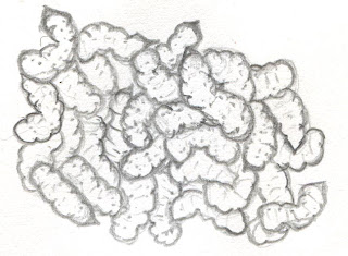
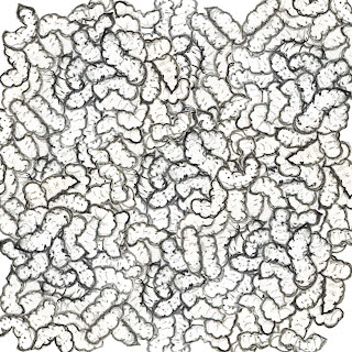
I needed to draw a large amount of maggots for my piece. I decided to fill a 5cm X 5cm area with maggots to provide some variety to my image. I then scanned the image into Photoshop and used the copy, paste and free transform tools to tile my maggots without creating a visible pattern.


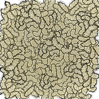
I then used various filters to define my image to avoid it looking too much like a drawing. I used the contrast tool to darken the lines of my image to remove any pencil marks. I used the plastic wrap filter to try and provide some 3D texture to my Maggots to make them look more realistic whilst still in keeping with the illustrated theme.


I used a paintbrush set to a high opacity to colour my maggots. I had to research images of maggots on the internet to try and find the common colour. I then used the colour sampler tool to extract a colour to use. I washed the colour over a separate layer and placed it behind the maggot image as to not lose the dark lines of the image, which i would have done if i had placed the colour on top of the same image.

Rat drawing

Before i began to draw my image, i looked at actual photos of rats as i needed my image to look as realistic as possible, so it would still have a strong message but would not affect the audience.


I then scanned the image onto Photoshop and used different filters and techniques to try and make the rat look defined and detailed. I used a paintbrush with a high opacity setting to achieve the colouring.


I then wanted a kitchen background. I found an image on the internet of the style kitchen i wanted to use. I used the tracing paper tool in painter to create an outline of my kitchen using the image off the internet, and then added to it myself to create my background.

14/10/2010

Today I had a meeting with my teacher about my progress so far. I showed Jo my blog and then my poster. We discussed the Practical, Financial and Legal obstructions of the poster and how to go around them. We also spoke about the layout and content of my poster, including the font and colour choice and the overall presentation. It is important that i make it clear that the maggots poster must be clear that the food bins are an aim to avoid the maggots. This must be made more obvious by using slogans.
There is also a problem with the colour of my writing, as it is not readable.

Me and a member of my group debated about the information given to us about what fonts to use. I thought that we had to use Ariel as the set font, as used in all other BANES posters, however she thought it wast compulsory. We emailed Tim from BANES to sort out our query.
This is a list of all the things i need to do to compete the project

Experiment with the poster layout using Photoshop
-moving around fonts
-changing the shape of the picture

Make the writing clearer
-Experiment with different fonts
-Experiment with different colours
-Move around the fonts
-Change the size of the fonts

Wednesday 13 October 2010

Interactive practitioners

Sustrans

Sustrans are a charity that aim to provide alternative ways to travel other than a car. They work with many other companies, local authorities and the community to try and improve the health of people and the environment.
This particular poster displays the fact that leaves on the line would affect people who ride on trains but not people who cycle. The photograph uses the perspective of someone looking down onto a cycle track. The white diagonal line that cuts the image across one corner links with the phrase 'leaves on the line?' that works well. There is a limited palette of colour on the image, as the pavement and paint is monochrome and the only colour is the leaves. This works well as the leaves are the main subject of the poster so they stand out. Like my rat idea, the image is set at a perspective of someone on the pavement, but all the text added digitally is at a straight on perspective. I think that this allows the reader to decipher between the image and the information, which could be difficult when using an image with text. This is similar to my work as it uses a simple image and a tag line which leaves a powerful image in the viewers head. This theme is carried out in many of their other posters, such as an image of a bike seat with 'a guaranteed seat every day' printed above it. Although the font is small it carries a strong message about what the charity are trying to provide. The use of short, snappy and well known tag lines is what i am aiming to achieve in my work.

Source: http://www.sustrans.org.uk/

Interactive practitioners

Claes Odenburg

Claes Odenburg is a Swedish American sculptor born in Sweden 1929. He began using soft materials to create large scale sculptures of objects, which were sometimes interactive. He describes his work as the ‘celebration of the everyday’ and creates it to defy our perceptions of the every day life. He works alongside the Dutch-American pop artist, Coosji Van Bruggen to create his large scale sculptures. They began collaborating in 1976 and got married 1977. In the early 1970s and again in the 1990s the pair also collaborated with Frank o'Gehry. They were said to have broken the boundaries between architecture and sculpture. Initially his work received lots of criticism as people did not understand what he was trying to produce, however his quirky inanimate object sculptures won the hearts of the community as it looks at inanimate objects in a completely different light. Odenburg begins the process by creating many small sketches, that would include the background to show the scale in which he wanted to create the model. He then creates some small scale models using cheap materials such as cardboard and wire. He uses many different materials when creating his large scale models, such as his 'apple core' piece, situated in Jerusalem, that contains steel, foam, resin and enamel and stands at 7ft tall. He uses soft materials to create objects that should be hard, and large objects when they should be small, forcing the viewer to reassess their perception of the objects.

Sources:
http://en.wikipedia.org/wiki/Claes_Oldenburg
http://www.guggenheimcollection.org/site/artist_bio_121.html
'Claus Odenburg : An Anthology' - Hayward Gallery

Interactive practitioners

JR

JR is a photographer who displays portraits of people in controversial and public places.
He began as a graffiti artist as a teenager but was introduced to photography soon after; He now calls himself a “photgraffeur”
Unlike many interactive practitioners, JR has never had to ask for planning permission, as he stays anonymous. This allows him to exhibit his work wherever he wants. JR is respectful with his work. His images on the rooftops in Kibra were made of vinyl, which made the residents houses waterproof. The corrugated metal used to display his work in other areas is distributed between all those who had taken part. All the money JR makes from auctioning his work is put back into the project to insure his work is sustainable. There is an interestnc perspective of his work, as it is all on the rooftops, which means there would be no way to see it unless you were up in the air. JR only uses black and white photography on all his projects, Which works well in this paticular project as it contrasts with the orange buildings.
The Parisian riots in 2004 allowed JR to produce a new exhibit, pasting up photographs on the walls on Marias. His work was praised for its unique photographs, as they contained residents of the location pulling funny faces through a fish eye lens. This was different to all other images of the rioters that were taken with a long lens which displayed the destruction. JR’s unique take to the event confronted passers by with a more human image.
The idea of putting a new perspective is similar to my work, as I am looking at the positive aspects of recycling bins from a negative point of view.

Sources:
http://www.guardian.co.uk/artanddesign/2010/mar/07/street-art-jr-photography

Interactive practitioners

Tim Noble and Sue Webster

Tim Noble and Sue Webster are artists based in London, where they work and live together. Their work is created by meticulously placing pieces of rubbish that has been picked up around London, so as when a light is projected at the sculpture an image is projected on the wall. Looking at the piles of rubbish there does not appear to resemble anything; however the shadows it creates are detailed and recognised images in silhouettes. Usually as a sculpture there is unlimited perspective in which this can be shown, however, the actual art is what is projected on the wall which makes the image a flat straight on veiw.. The rubbish that is used contains a lot of texture which makes the shadow more realistic and the colour contained within all the rubbish does not effect the overall shadow.
They also work with lights to create images that reference pop art. These light sculptures resemble carnival rides and often have flashing lights and words expressing love or hate.
Scrap metal, food packaging and the remains or dead creatures such as rats, are collected by Noble and Webster in their every day life. They pick up dead rats off the floor and put them in their freezer as they feel it would come in useful in one of their later sculpture. Once they have found a use for all of the rubbish, they begin creating the precise sculptures, making sure everything is in just the right place to create the silhouette.
This is a strong way of making use out of every day rubbish and turning it into something amazing. This work could be used in inspire the groups working with the scrap store. Sculptures could be made out of all the artistic materials donated by the companies, which could advertise the good use that can be made out of the scrap donated.

Source: http://www.youtube.com.com/watch?v=a-Ki-abe1RM
http://en.wikipedia.org/wiki/Tim_Noble_and_Sue_Webster

Interactive practitioners

Lady Gaga


Lady Gaga’s meat dress has been the topic of many debates since she wore it at the VMA awards. Created by Franc Fernandez, the meat dress has many interpretations. Gagas interpretation is that the dress stands for “if you don’t stand up for what you believe in, soon you will only be worth the meat on your bones”.

They way that the dress has been displayed disgusts most of the viewers, however I feel that it makes a statement of the worlds view on food. The majority of Europe and America eat meat every day, however when displayed in its natural state they cannot handle it.

It is said that lady gaga wore this outragous outfit to symbolise war, claiming that it represents the waste of life.

Friday 1 October 2010

obstructing factors

Although i want to apply scare tactics to my poster by using graphic images of maggots and rats, there is a possibility that people will be too affected by the images to read what the poster is about. This affects my process as it makes me have to change my idea. Ive decided that the images are going to be drawn which would decrease the amount of people that are unable to look at it due to fear. I will be finding pictures of my subjects (rats and maggots) by taking photos of maggots in a fishing shop and using the image to draw them. I will take a picture of someones pet rats for inspiration for my own drawing. This is a strong idea as the final result can look exactly as i want it to.